How to add a Prefix Icon to Ant Design Select Component.

A Frontend Developer passionate about building products and solutions using technologies revolving around the Javascript Ecosystem. I have experience working with the MERN Stack and also a big fan of the JAMStack methodology. Currently, I'm exploring Figma in my spare time and other design tools in order to create much simpler and easy to use interfaces for my users.
Ant Design Select component has a lot of properties that can be passed into the component in order to enjoy it to the fullest, but one property I wished it has is the prefix icon. Recently, I was tasked with building a product that involved a lot of Select Dropdowns and the prefix icon was part of the component’s design, so I built an extended version of the component giving room for me to add the extra props I needed for it to work perfectly.
In this tutorial, I will be explaining how I extended the Select Component and how you could add other properties to it if needed.
Prerequisites
Ensure you have the following catered for before going on with this tutorial in order to have a seamless experience going forward:
- A Text Editor or IDE e.g VS Code
- Basic knowledge of React (we’ll be using Typescript)
Step 1: Setting Up our React Project
I have created a starter project on CodeSandbox in order for us to focus on the actual implementation of the Select Component. You can find it here.
We’ll be making use of styled-components for our styling as it makes writing styles that are scoped to a component very easy. You can read more about styled-components in their docs.
Step 2: Creating our CustomSelect File within the project.
Create a new file called CustomSelect.tsx in our project folder like so:
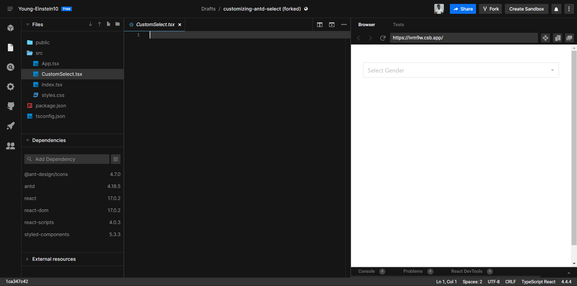
This file would contain our implementation logic for how the Select Component would work with prefix icons. Now, let’s update the file we just created with the following code:
import React, { ReactNode } from "react";
import { Select, SelectProps } from "antd";
import styled from "styled-components";

type CustomSelectProps = SelectProps & {
  prefixIcon?: ReactNode;
};

const SelectWrapper = styled.div`
  position: relative;
`;

const CustomSelect = ({ prefixIcon, children, ...rest }: CustomSelectProps) => {
  return (
    <SelectWrapper>
      {prefixIcon && <div className="prefix-icon-wrapper">{prefixIcon}</div>}
      <Select {...rest}>{children}</Select>
    </SelectWrapper>
  );
};

export default CustomSelect;
We added a styled wrapper around our default Select Component which is imported from Antd Design, then we created a condition that displays our prefix icon depending on whether it's passed down as props to the CustomSelect component.
We also created a custom type CustomSelectProps which is made up of type SelectProps from Antd Design and our prefix icon which is being added. Our prefix icon is of type ReactNode which would enable us to pass down any value that’s a ReactNode as our icon.
Now, update the Select Component in our App.tsx file like so using our newly created CustomSelect component:
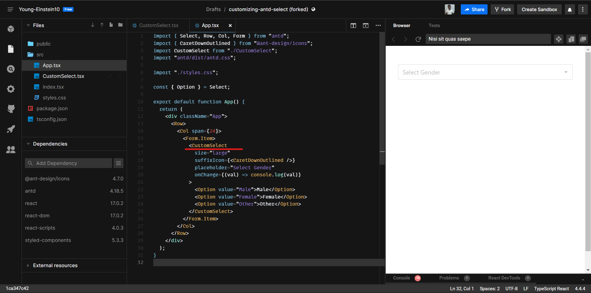
Step 3: Adding a Prefix Icon to our Component.
Pass any icon of your choice as props to the Select Component so we can have a look at how it’s being displayed currently. I’ll be adding the UserOutlined icon from @ant-design/icons like so:
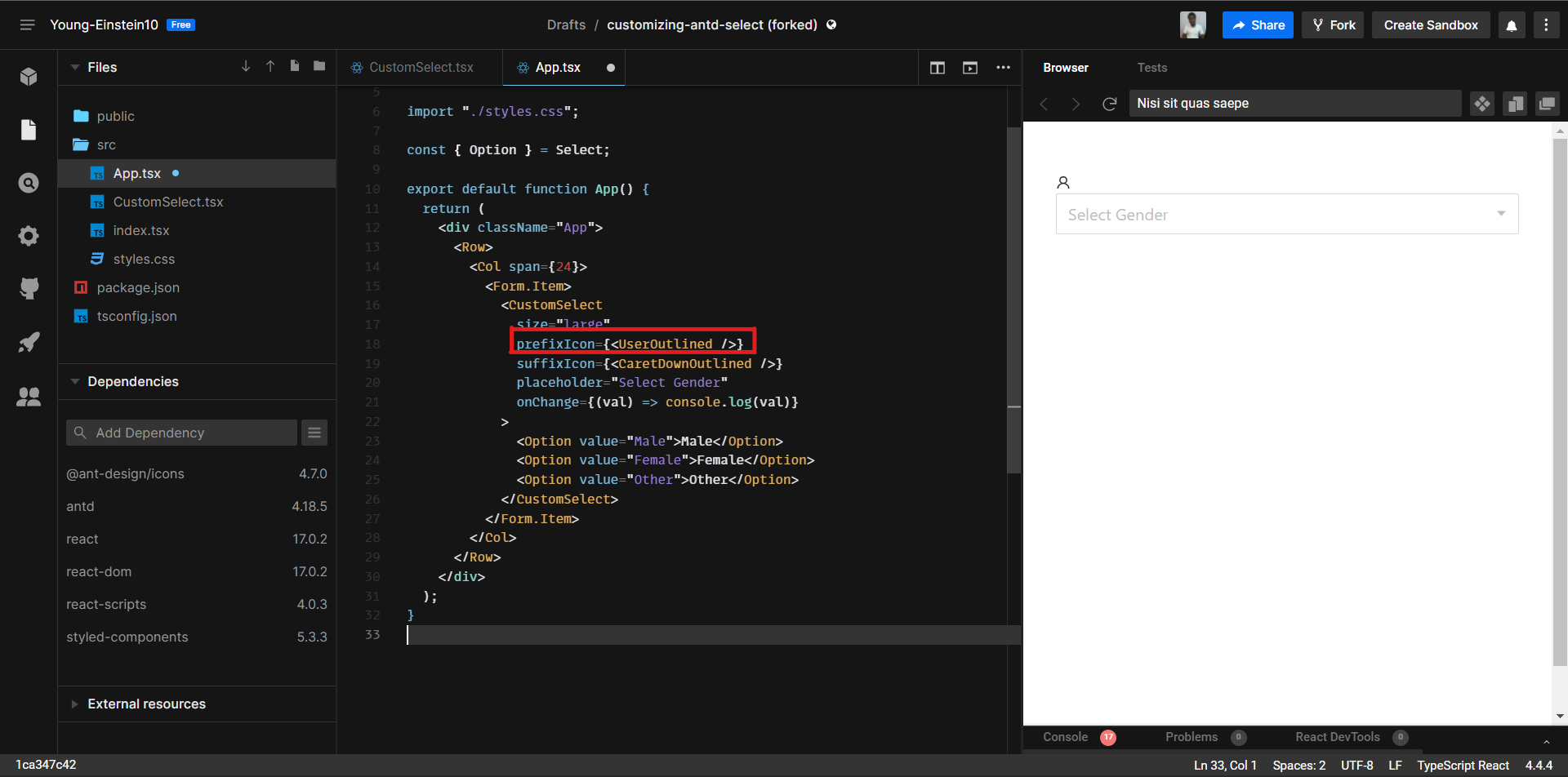
Currently, our icon is displayed above the Select Component which isn’t what we want. We’ll fix it by adding the appropriate styles in our CustomSelect.tsx we created. Update our SelectWrapper styles as shown below:
const SelectWrapper = styled.div`
  position: relative;

  .prefix-icon-wrapper {
    position: absolute;
    z-index: 1;
    width: 3rem;
    height: 100%;
    display: flex;
    align-items: center;
    justify-content: center;
  }

 && .ant-select .ant-select-selector {
    padding-left: calc(3rem - 8px);
  }
`;
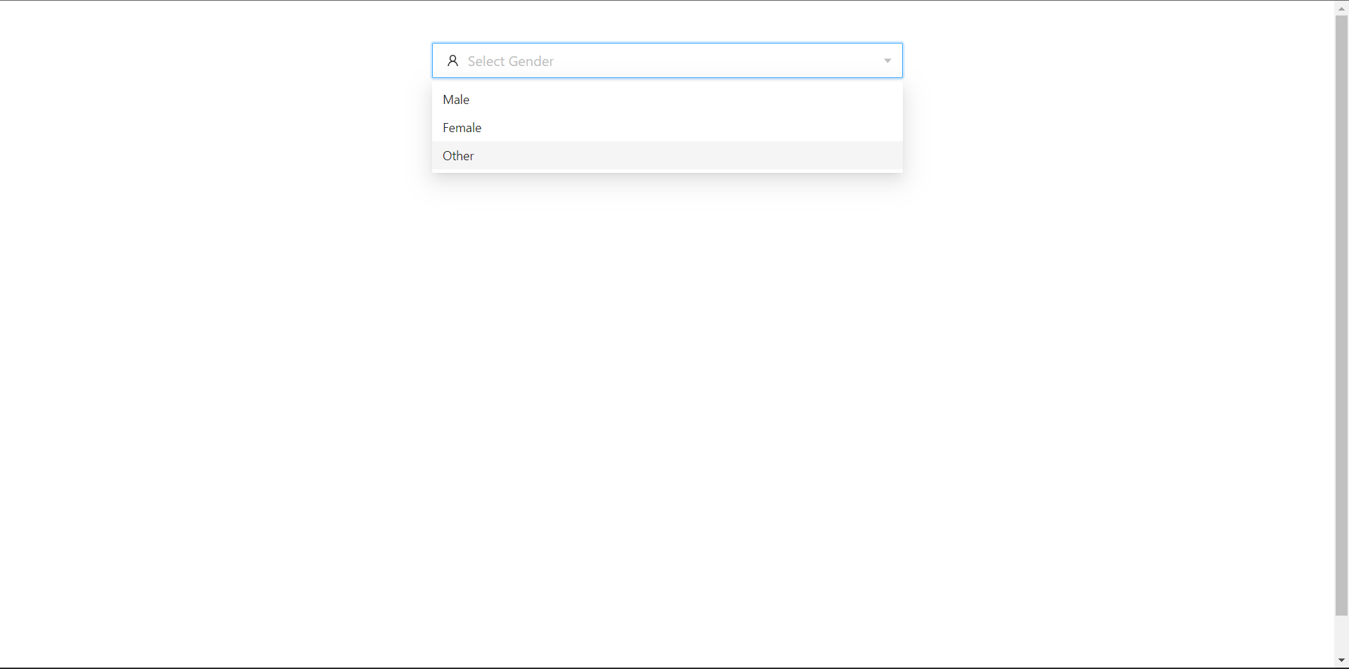
We’re positioning our prefix icon using the prefix-icon-wrapper we gave its wrapper, this would enable any icon added to the Select component to be properly aligned in our Component. Also, we subtracted the left-padding value of the Select Component from the width of our icon, this would enable the spacing between the Icon and the Select Component to be properly distributed.
Our CustomSelect component is now ready for use 😎.
Conclusion
In this tutorial, we learned how we can Customize Antd Design Select Component by extending its props and allowing any kind of icon to be added to it as a Prefix Icon.